If you're a coder you probably try to modularize everything to death on a daily basis. If not, your practices are a little suspicious. :nervous: Alas, it's not so easy to knock out something that I can say with confidence will be reusable in the future. One piece of functionality I keep reimplementing is output in colors, because it's hugely helpful to making things look more distinct. The first time I wrote this module I knew I would be using it again and I wished to make it nice and reusable, but I didn't know what the future uses would be. So I put that off until "later". In the meantime I copy/pasted it a couple of times into other projects. Shameful, but effective.
I finally got around to organizing these types of bits that have no specific place of their own into a new github repository, appropriately named "pybits". It holds the pretty printer and this rewritten ansicolor module, and it'll probably grow with the ages.
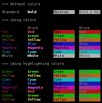
But to business. Anyone spitting out ansi escapes who has figured out the system knows it's trivial to make a color chart. So to keep the tradition going, here's proof that ansicolor is able to enumerate the colors:

Notice that section at the bottom about highlighting colors. As you might be able to deduce by sheer logic, black and white are not great colors for highlighting something in a terminal, because they are typically used respectively as the background and foreground of the term (or vice versa). (The colors of a term can actually be anything, but black and white are the common ones. Ideally, code should detect this at runtime, but I don't know of a way to check for this. Besides, lots of programs [eg. portage] do make this assumption also.) So the highlighting colors are supposed to be useful for when you want to output a wall of text and mark something in the middle of it, so the user can spot it.
Suppose you are (as I have been in the past) developing a regular expression and you can't get it right on the first try (yeah, unbelievable, I know). Well, what you do is highlight the string so you can see how the matching worked out:
![]()
Regular expressions tend to get hairy (yes way) so it helps to compare their results when you're trying to unify two half-working variants into one. Adding a second regex will show the matches from both. Where they overlap the styling is bold:

Think of the green highlighting as a layer of paint on the wall. You then paint a layer of yellow on top, but you don't cover exactly the same area. So where the green wasn't painted over it's still green. Where the yellow covered it, the paint is thicker. And where the yellow didn't overlap the green it's just plain yellow.
Adding a third regex potentially produces segments highlighted three layers thick, so there the color becomes reverse.

And then bold and reverse.

ansicolor doesn't support background colors, but that's a product of my use so far, I've never needed it. I don't think they improve readability.
You will find this cutting edge technology in the repo:

 August 6th, 2010