The history of bookmarks is one of those tragic stories in technology. When bookmarks were first introduced (by Netscape? or maybe it was Mosaic?) they were a huge step forward. Trying to memorize urls or writing them on paper clearly weren't methods that worked well. The idea -- and so simple too -- that the browser could remember the urls for you was the perfect solution.
Sadly, since the "big bang" of bookmarks there have been precious few new explosions.
The basic problem
The introduction of bookmarks, welcome as it was, created a problem that remains with us today. Once you start bookmarking pages, you inevitably produce a list of bookmarks that becomes more chaotic and less useful the longer it gets. Sure, a list of bookmarks is useful when you can look at it and quickly know what is there, and when you can see the bookmark you want to load right now.
But when you start having to scroll the list, and not only that but use the PageUp/PageDown keys to scroll the list quicker, it's a good sign that it's getting out of hand.
A collection of bookmarks is all well and good, but it needs some kind of structure superimposed on it to remain effective.
The bookmark toolbar
The bookmark toolbar encapsulates the insight that some bookmarks are more important than others and offers a number of improvements:
- Allows marking some bookmarks as more important/more frequently used.
- Gives them better visibility.
- Provides quicker access to them (by not having to go into the bookmark menu).
The bookmarks are displayed on a toolbar, either as links or as links-within-folders.
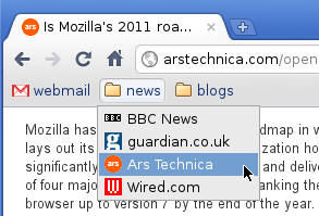
Despite how useful this feature is, browsers have historically treated it as something of a marginal feature. Firefox, for instance, used to view the launcher toolbar as just another folder in the bookmarks collection (albeit with a special name, like "Personal Toolbar Folder"), which you could accidentally rename or delete, and then it wouldn't show up as a toolbar anymore.
Another thing that matters a lot to the usability of the toolbar is the drag-and-dropability of bookmarks onto the toolbar, into the folders, and from one place to another. Even today, for instance, in Google Chrome I can't reorder the items in a folder on the toolbar without opening the Bookmark Manager.
Import/export (and the silo)
It hardly needs stating that once you have a bookmark collection in one browser, you don't want to manually recreate it if you decide to use another one. Browsers have historically been reluctant about giving out their bookmarks. All too often, despite making a show of offering to import your bookmarks from another browser, the import mechanism has bordered on the useless.
First and foremost, every browser vendor since the Ice Age has been eager to supply you with a tasty selection of bookmarks that he was convinced you would love. Importing your own bookmarks, therefore, could at best be seen as a supplement. No browser would ever just take your existing bookmarks and overwrite its own vendor-supplied ones, which is exactly what the user wants. Instead, it would stash them somewhere in the bookmark collection, well out of sight. Any additional metadata that was implicitly stored in your bookmarks would often be lost, like the order in which they were listed.
In particular, the browser would make no bones about trying to find out if you have a bookmark toolbar in there, and replace it with its own (despite the browser having a toolbar feature that worked exactly the same).

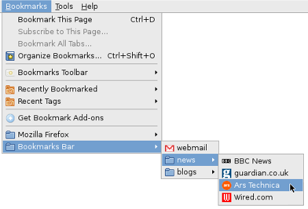
So having done an "import", you would typically have to manually organize your bookmarks, nuke the stupid vendor bookmarks, and sometimes you'd even have to recreate the folder structure of your bookmark toolbar, all before you had been able to achieve the same state as in your other browser.
This kind of situation is standard silo behavior. By making the import feature so mediocre, the browser vendor would pretty much ensure that the user would not switch browsers without paying a high price for it. Simply using more than one browser on a daily basis, with an easy way to manage your bookmarks across them by a quick sync, is just not realistic.
Bookmark sync (and more silo)
A way of keeping your bookmarks synced across computers has been a no-brainer feature since the era when people started accessing the web both at home and at school/work. And yet, a working synchronization feature is a pretty recent development in bookmarks. I recall some failed attempts with Firefox extensions in the remote past, but at last it is here.
A number of browsers have a sync feature now, and it's a big step forward in bookmarks. Even if your bookmark collection is a mess, you can at least have the same mess all over the place. Clean it up and it's clean everywhere.
And yet, bookmark sync is yet more silo behavior: you can sync your bookmarks from Opera to Opera, but not from Opera to Firefox. The fact that bookmark sync doesn't do the same half-assed job of the import feature might seem strange, but the motive is very obvious:
- ability to have your bookmarks up to date in our browser on every computer = good for the vendor
- ability to have your bookmarks up to date in every browser = bad for the vendor
Browser vendors know very well that if bookmark sync worked as poorly as bookmark import, they couldn't sell it as a feature, because noone would use it.
Bad page titles
Strangely enough, I've come all this way without mentioning just about the most glaring problem that bookmarks have: bad page titles. Since the name of the bookmark is simply the title of the page in 99.99% of the cases, the title ought to be both descriptive and concise. Instead, we have historically seen that web creators much prefer titles that are variations on this theme:
The Excessively Long Title Of My Website Which Is Very Nice Indeed: Section Title: Article Title
With titles like that, all too often you can't even see the title of the article in your bookmark list, because the text is truncated somewhere in the middle.
Quite apart from the length problem, web sites often prefer to give articles catchy titles rather than descriptive ones. So with a title like:
Something Amusing That Makes You Think About What The Page Really Is About
you have the short term benefit of being amused at the cost of the long term benefit of a descriptive title.
Bad metadata
Bookmarks belong eminently to the category of things where the number of items is so large that it would be great to have a way of automating the retrieval/organization of the items.
Yet, despite announcements from Mozilla in the past that they would soon obliterate the old model of bookmarks-as-a-list, and introduce a new and all-conquering search based approach, we still have the list. The fact is that bookmarks don't contain enough metadata to make search useful. A bookmark has two pieces of data:
- The name of the bookmark.
- The url.
Sure, some browsers give you the option to store other things too, like tags, but if we all agree that the user can't be bothered to keep their bookmarks organized, let's not pretend he will actually input any of the optional stuff. And even if he does, 90% of his bookmarks won't have any other data associated with them, so we're back to the short list above.
So why doesn't search make sense? Because much too often neither the title nor the url contains any of the keywords that you would want to use in order to find this bookmark. Web sites don't pay too much attention to titles, and the real data that would be useful to search is the page itself, which is not available.
Bookmark oblivion
What should seem ironic is that bookmarking a page often has the effect of not bookmarking it at all. The bookmark is saved somewhere in the long list and then never seen again, either because the list is too long to really bother looking at beyond the most recently added items, or because the page title is useless, or because it was bookmarked "for future reference", and by the time we return to this topic we've forgotten about the bookmark.
We tend to grow pretty oblivious as to what's in our bookmarks. Over time, some pages expire, others drift out of our sphere of interest, yet the bookmark collection doesn't get updated.
Just about the most obvious feature a browser might offer is to try loading the bookmarks from time to time, in the background, and marking the ones that return 404.
Another idea might be to offer to list bookmarks according to how often they are loaded, making the never used ones fall to the bottom of the list. Applying this to the bookmark folder might be especially useful, so the user doesn't have to reorder the bookmarks to make the frequent ones quicker to reach.

 February 15th, 2011
