Archive for the ‘ui’ Category

(k)ubuntu: for the love of god stop crippling KDE

October 14th, 2007

Here's the thing. KDE is a wonderful project run by inspired people. It has its problem yes, but all the same it delivers a really outstanding product. It's by far the most exciting happening on the desktop the last couple of years. These people know what they're doing.

You are Kubuntu. You want to bring KDE to Ubuntu users, because it rocks. But here's the problem: you think you know better. You don't. Being a packager does *not* make you an authority on what people want. KDE is fine as it is, stop messing it up.

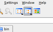
I use konqueror as a file manager, it's great for that. In Gentoo, this is what my toolbar looks like. Notice the selected button, it's called Tree View. I use tree view 99.6% of the time. The button next to it is called Icon View. When you install konqueror in Ubuntu you only get this button. Frankly I don't care about the Tree View button, I can get tree view by using the drop down list on the Icon View button. (Yes it takes longer but I so rarely switch view mode.) Here is what I do care about. When I set the view mode to tree view in my current tab and then open a new tab, in the new tab I get icon view. Congratulations, you have just reproduced one of the most infuriating behaviors of Windows. I have looked around and there is no configuration setting for this in the dialogs. In Gentoo I set tree view and it "just works", tree view all around. Kubuntu just couldn't help themselves, they had to break it.

Another application I use all the time is kate. It's the most practical editor to view files in, although gvim is a bit nicer when you have much editing to do. When I open a file in kate the document list tab always opens. I don't want it to always open, I want it to save on exit. It also does not remember the size of the tab, so the result is this:

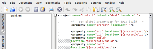
One third of the window size is wasted on the document list, even though the filename obviously doesn't need all of it. Meanwhile I get line wrapping in the document pane. Once again, on Gentoo the size is remembered and it "just works", on Ubuntu it's broken.

Here's the thing about user interface experience. It's a very fragile thing. Even if everything else works as it should, one little problem, if it keeps coming up *all the time* can destroy a good experience. And especially knowing that this has worked seamlessly on Gentoo for years is completely infuriating.

Bug #152621

EDIT: Fix for the tree view breakage.

bad ui on display in dia

September 7th, 2007

Dia is a really useful application. Perhaps there is some better one out there, but it's the best app I've seen for drawing diagrams. When I need to draw a diagram for a technical paper or a presentation, dia is essential.

Having said that, it has some really bad interface problems. Not that ui is any kind of expertise of mine, to me it's just common sense and if something gets in my way I think it's badly designed. For that matter, I have read quite a few criticisms of bad ui, but never one that strived to be complete, to give a full review of the application. It seems that ui critique is really about pointing out one or two bad bits. And that's what I'm doing here as well. So obviously this doesn't mean the whole application is useless and everything is wrong.

MDI/SDI

Some people have really strong feelings about this issue. Personally I think it has to be settled on what is best for the application in question. Firefox is Single Document Interface, ie. you have multiple windows. Opera is Multiple Document Interface, where you have one main window and more windows inside of it ("multiple" refers to these sub-windows). To me there is no question that Firefox is much better off for this. Everything you need to do in Firefox is constrained to the one window, you don't need multiple windows visible unless you're doing some kind of copy/paste activity.

But editor apps have other needs. Photoshop is SDI (as are most image editors), the gimp is famously (and painfully) MDI. Dia copies this bad choice. I suppose the argument is that when you have your canvas window separate, you can maximize it and work on your document full screen. However, unlike Firefox, you need a lot of tools to do this, so unless you've memorized keyboard shortcuts to select them, you have to bring the palette, layers and other windows to the front anyway. This is a huge pain when you don't *dedicate* your workspace to editing, but you also have half a dozen other applications open.

No menubar in the canvas window

This is my biggest gripe with dia. For better or for worse, this is the kind of diagrams I draw in dia (below). I rarely use the in built stencils, because they all assume some specific kind of diagram other than what I need.

dia_filemenu.png

As it happens, one of the more useful functions in dia are the layers, when dealing with more complicated diagrams. To bring up the layer window, I have to right click on the canvas to get the main menu first. Why this menu isn't fixed at the top perplexes me (apparently it's possible to change this, but defaults are much more important than configuration options). Well, you might think what's the difference, either way it's just one click away. The difference is that when it's a fixed menu, it's always in the same place, it makes it easier to use, you locate items quicker visually.

A lot of useful things are in the main menu. Like alignment of objects. This is found in the Objects > Align submenu. Needless to say this is quite a pain to invoke more than a couple of times. This should probably be made into a palette window.

One thing I really like about dia is the number of different formats it can output. Most of my diagrams are pngs. This is called Export in dia. But to export my diagram (rather than save it in dia's own format), I need to choose File > Export from the menu. There is no keyboard shortcut for this action. If I'm tweaking my diagram to see if it looks good in a report, I have to do this export ritual several times. Awful.

Other quirks

And do you see that zoom control in the lower left corner? I can't change the zoom level with my mousewheel (like in the gimp). Bad.

In the above screenshot, if I wanted to place some object above the rectangle, a distance greater than what I see in the canvas, I have to scroll up. Except that the scrollbar doesn't seem to allow this, it seems to indicate that the canvas can't be larger than this. The mousewheel will actually scroll up, which is inconsistent with the scrollbar.

toward click-free guis

July 29th, 2007

I think that a big part of user interface improvement lies in re-examining old answers to still existing questions. For example: when do we really need to click the mouse?

Motivation

I think we could do with less mouse clicks. And if nothing else, a click-free mode you can turn on if you want to.

survey_sheet.png

I don't know how many long surveys you've taken, but I find them daunting. My question is: why do we need to click to select?

I think the answer is that most people use their mouse pointer liberally and they think as long as I don't click anything, there's no way I can screw up. And thus introducing selection-on-mouseover would be too subtle, and too confusing.

So let's eliminate the confusion.

A mockup

This is a configuration dialog from Konqueror (slightly modded to just show the part I'm interested in). Nothing has happened here yet, this is how it looked when it came up.

konq_dialog.png

Now I want to select the platform option, so I move my pointer over it and the dialog changes to look like this:

konq_dialog_modify.png

The option I selected has become blue, which tells me that this option has been modified.

The two buttons OK and Apply have also become blue, which means that if I click one of them I confirm the modification I have made.

(Should it be necessary to click the buttons or can I just move the mouse over them? Let's go conservative for now and require a click.)

But suppose I don't want to turn on this option after all. I move my pointer away from it, and then I move it over it again:

konq_dialog_unmodify.png

The checkbox has become unchecked again, so the option is deselected. But since I considered turning it on, it's highlighted in yellow to tell me that I thought about it.

Also, the Defaults button is now highlighted, to show that the current settings correspond to the defaults. It's highlighted green to tell me that I have re-entered the default settings.

All good?

One problem that comes to mind is this. If I move my pointer over the dialog I select every option unless I'm very careful:

konq_dialog_pointer.png

One solution could be to set a certain interval during which the pointer has to be on the option I want to select. For example half a second. This would be configurable, of course.

eliminate mouse wheel clicks

July 14th, 2007

As much as the mouse wheel was a good idea, making it a clickable button was a *bad* idea. The mouse wheel is more sensitive than the left and right buttons, and it has too many jobs. Newer mice also do horizontal scrolling, which makes it even more flexible. Pushing down the mouse wheel to click has always been uncomfortable, for the simple reason that it *moves* in other directions beside down, it's not static.

When the mouse wheel was introduced, it was de facto a third button, and so the "natural thing" was to just make it that, adding to the scrolling functionality. Of course, the old Unix standard of mice also had three buttons, so that fits.

This button is important, because it's the Unix paste button, you use it all the time. In addition, Firefox made it its own, for opening links in tabs and for closing tabs. It has always bugged me that I had to use the mouse wheel button for that. Not enough to actually do something about it, but enough to bother me. :lazy:

So today I got the Logitech MX 400, where the mouse wheel button is actually harder to press in, and I decided to finally fix the problem. So here's what you do.

First you should know how many buttons your mouse has. You count every button, you also count scrolling (back, and forth, each count as a button). For example, my mouse has 9; the front two, a mouse wheel with 4 directions of scrolling, the mouse wheel button, and two side buttons. If you have some extra side buttons to use, you can use one of these as the paste button.

But you need to know which is which. Here's how:

$ xev

ButtonRelease event, serial 29, synthetic NO, window 0x2c00001,
root 0x61, subw 0x0, time 8209381, (102,133), root:(946,186),
state 0x100, button 1, same_screen YES

Here I started up xev, which brings up a little window. It prints lots of output about mouse and keyboard activity. When I move the pointer into the window and click, I get a piece of output like the above. Here I clicked the left front button, which is called button 1. In the same way, I find out that the mouse wheel button is number 2. While the side button I want to use as paste button is number 8.

Knowing this, I can remap the two buttons, switch their positions. Like so:

xmodmap -e "pointer = 1 8 3 4 5 6 7 2 9"

Here the numbers are sequential, except that 2 and 8 are swapped. Run this while X is running and you get the desired effect.

To make this permanent, you need to add it to your X session script. KDE is not very nice, because it doesn't give you an easy way to do it, so I just added the line to the startkde script (ugly hack):

...

xmodmap -e "pointer = 1 8 3 4 5 6 7 2 9"
# finally, give the session control to the session manager
# see kdebase/ksmserver for the description of the rest of the startup sequence
...

hierarchy of scrolling

June 25th, 2007

7. The arrows
scrolling_arrow.pngChances are that the first experience you had with a user interface, might have been your first experience with a computer altogether, someone told you that to scroll down the page, you use these arrows strategically positioned that scroll the page. This is officially the worst way to scroll, it's incredibly slow, and you have point your mouse at the tiny buttons each time.

Corollary: Some ui technologies emulate this button (certain flash sites) and instead of making you click it, they scroll when you hover over it. This is an improvement, albeit a small one. Most importantly, you still can't control the rate of scrolling.

6. Dragging the bar
scrolling_tab.pngNow you're one step up from clicking on the arrow. You realize it's too slow, so you grab the bar and drag it. This is a very imprecise scrolling method, but a much faster and empowering one. The problem is that you still have to use the mouse button for this, and since scrolling is something you do all day everyday, this is way too much mouse dependency.

5. Clicking the meter
scrolling_click.png
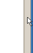
Clicking is an improvement on dragging, so your hand will prefer this. You click the gray area where the bar is absent and it scrolls page-by-page. You also don't have to position the pointer as exactly, just as long as it's somewhere on the long gray bar, much better. Here uis differ, some stop scrolling once the bar reaches the position where you hold your pointer, which is logical, others don't.

4. The arrow keys
scrolling_arrowkeys.jpg
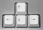
What if you didn't have to use the mouse at all? Face it, the keyboard is a much faster control device, and before you had windowing applications with hundreds of pixels to traverse, you didn't need a mouse at all. And it's a much more pleasant control too: I don't know about you, but I find pressing a key much smoother than clicking the mouse button. Maybe you have a fantastic mouse. So yes, you can use the arrow keys. But the rate of scrolling is the same as that of the arrow buttons, so you trade in control for ergonomics.

3. The mouse wheel
scrolling_mousewheel.jpg

Back to the mouse, hah, bet you didn't see that coming! Oddly enough, you might say, the mouse wheel didn't enter the mainstream until a few years ago. It's true, if you go to a museum that has computers from 10 years back, the mice don't have wheels. The mouse wheel is a big improvement, because it doesn't divert your mouse movement to that damn scroll bar on the right side. When you click around, you can just keep your pointer exactly where it is and scroll with the wheel, it's fantastic. But again, the scroll rate is limiting (but it's more than the arrow buttons). If you need to scroll a big amount, the mouse wheel is out.

2. Good ole spacebar
scrolling_spacebar.jpg

Who'd a thought, after all these years, eh? The spacebar is positioned optimally. If you're right handed, your right hand will cycle between the keyboard and the mouse, but the left hand will be on the keyboard. And vice versa. The spacebar is right underneath your thumb, it's the quickest way to scroll. And you scroll page-by-page, which is efficient too. But it only scrolls down.

1. PageUp/PageDown
scrolling_pageupdown.gifThis is just like the linux programs more and less. The former only scrolls down, the latter scrolls up *and* down. The location of these keys isn't as good as spacebar, but they are still nearby for the right hand (even better if you're left handed and operate the mouse with it). The keys are at the end of a row, so it's easy to find them without looking. They (obviously) scroll page-by-page and so you have full flexibility. If you're only reading something and you keep scrolling down, you can do with spacebar, otherwise you go to PageUp/PageDown. And if you desperately need granularity, you can grudgingly go to the mouse wheel.

Corollary: One quirk with the keyboad methods is that the content pane must be in focus, which doesn't happen by default on page load in Firefox, so I first have to click inside the content to get this activated. A pet peeve.