It can drive you to do terrible things, it really can. Prime example, follow me. You're trying to open a web page someone gave you but the url is on paper so you have to type it in yourself. You really need to check this website cause it's vital for x reason. So you're finally done typing it, you hit Enter and it won't load. Firefox pops up a dialog saying the page cannot be loaded. What am I, blind? I can see that, you jackass. Worse still, you open 5 tabs and load pages in each of them, your network connection goes sour and none of the 5 can be loaded. What does Firefox do? You guessed it, 5 dialog boxes. Whyyyyyyyyyyyy? Why not report the error in the status bar, like good old Netscape did? Or if that's not "visible" enough, load up a special page that says "the site you tried to connect to cannot be reached". Like Opera does. Yes, I know IE does the same but it also replaces the url in the address bar, you know the one you so painstakingly typed, with an internal url for that page. That hateful mofo.
Next up, confirmation dialogs. Why do I have to confirm things all the time? If you go to someone's house and they offer you a drink, you accept, do they ask you to confirm your choice? No, of course not, that would be imbecilic. Since you said yes already, there's no need for a further inquiry. Humans do not confirm things all the time. So don't make me confirm trivial choices on the computer. But above all, if you absolutely HAVE TO toss out a confirmation dialog, by the grace of $your_god, make the OK button pre-selected so I can hit Enter and move on, instead of having to use the mouse. I read the dialog the first time, from session #2 and out, I know exactly what I want and I just want to move along. A good example of confirmation dialogs? Football Manager 2005. It makes you confirm _everything_. "Do you want to start a match?", "Do you want to make these changes to your lineup?", "Do you want to place this transfer bid?", "Do you want to kill yourself already, you sob?". Now the interesting part is that prior versions of FM (or CM rather) didn't have this. CM3 didn't, neither did CM2 nor CM1. The "feature" first appeared in CM4. Why do you think that is? Were there so many people requesting confirmation dialogs because they had started a match prematurely or placed the wrong transfer bid? No, far more likely, some evil design person decided to follow these wonderful, new user interface "guidelines" and ended up making people's lives annoying. Just for the hell of it. In CM4 these dialogs weren't even dismissible by Enter or any other hotkey. By FM5, they had at least put in the effort to make most of them go away then, but not all. Now how stupid is that? I have to memorize which dialog I can dismiss with Enter and which one I have to use the mouse for. Lack of consistency is a terrible sin and should be punished severely.
Let's go into that a little more. 90% (or whatever the number is these days) of people still use Windows. In Windows, the standard is that every confirmation dialog has "Yes/OK" on the left and "No/Cancel" on the right. This standard has worked amazingly well for a decade. Why someone decided that wasn't good enough is beyond me. So they started changing the buttons, so they would take more time to read and make them more confusing. In gtk, the save dialog says "Do you want to save your changes?, Don't save, Cancel, Save". By default I pick the left button, so I don't save, but why is Cancel stuck in between Save and Don't save??? And why do these people have to rearrange the buttons so often? I'm so confused that I cannot honestly say whether the gtk buttons have always been like that but I'm pretty sure they have been moved around. But back to the original point. "Do you want to save? Yes, No, Cancel". What the hell is wrong with that one??? In kmail, if I start a new message and try to close the window I get "Do you want to save the message for later or discard it?, Save as Draft, Discard, Cancel." See, at least kde sticks to the established standard, Yes, No, Cancel, in that order.
Another example, why are mime types so difficult? I have not yet come across one desktop environment where you could choose your file associations from a gui and have the program REMEMBER THEM EVERYTIME. Just yesterday, I tried to make mp3 files open with mplayer by default instead of that piece of trash noatun. In konqueror, I make the choice but it doesn't remember it. I do it again, still doesn't work. I try a different method, now it does work. But noatun is still in the menu and I want to get rid of it, for some idiotic reason it won't let me. There is no consistency in mime types. Not in Windows, not in KDE, not even in Firefox. If I open an mpeg in Firefox, I get a dialog that gives me a choice between opening the file with an app of my choosing and saving it on disk. There is also a checkbox saying "Always do this action for this type of file". As you guessed already, I use that checkbox a lot. But evenso, I still get that dialog for some mime types, even though I expressly told it not to ask me again. A new twist this time - the checkbox is DISABLED. Why not just write "I know what you want but I'm going out of my way to deny you?"? In a dialog no less.

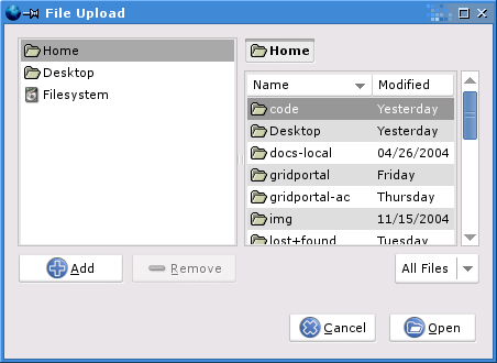
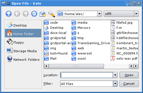
Worst of all, perhaps, the file chooser dialog in current gtk (shown in the screenshot above). How the hell do you not give me a chance to type in a path (or paste a path more likely)??? If I have a file deep in the file hierarchy I need to open, I have to navigate this annoying crap to find it. And once I do, it doesn't bother remembering that location, no I have to start from ~ again if I want to open the next file in the same directory. Apparently, the kde file chooser dialog (shown below), which gives you plenty of options with both "bookmarks", a chance to type the path (with auto-completion) and navigation buttons, is just too fucking difficult to use.

Now you may say that it doesn't really matter because it doesn't make a big difference. If you said that, you haven't been using a computer for more than 5 minutes. At least not to do anything productive. It *does* matter, it matters a great deal. Imagine everytime you got in your car and you wanted to close the car door, you would have to "confirm" the action but pressing a "safety button" preventing the door from closing unless you press it in, located on the bottom of the door? Already the first time it seems totally pointless, but imagine you work for Fedex and deliver packages to people, meaning you get in and out of your car 30 times a day. It would drive you insane. Stop thinking about the first time, start thinking about everyday use. Because it *will* get to you.

 July 13th, 2005

