slashdotted

October 2nd, 2006

The other day I had the idea to write an opinion of the Yahoo Mail Beta webmail service, which I found particularly disappointing, in a consumer oriented review style, which I thought would have wider interest than the average blog entry I write. I posted the story on digg and reddit, and noone was interested in it. Then I posted it on slashdot (they have an open submission policy, every submission gets reviewed by their editors to be either published or discarded) and it was accepted, so yesterday it appeared on the frontpage of slashdot.

Slashdot is the biggest technology news site, and one of the oldest geek establishments, so my review was destined for a lot of traffic. So much so that I used three times more bandwidth in a day than I did the previous month. I got lots of comments on the blog, and many many more on slashdot. So that was pretty interesting to see how people responded to something I wrote, which wasn't the most controversial of viewpoints.

What strikes me is how many people are unable or unwilling to accept an article on the merits that it's written. My review was from the point of view of a user who has been using Yahoo Mail for a long time, tried the new service and was not impressed with it. And that's honestly my standpoint. I never pretended to take into account the concerns of other users, I just focused on my needs all the way. It wasn't a news article by the criteria of a news site, Yahoo Mail Beta has been around for months. It is still news to many users, however, who have been using Yahoo Mail for years. So as a user, this beta software is news to me. And as it was just my opinion, I didn't try to make it out to be some kind of complete review either, I didn't research the service thoroughly, I just used it for a bit, as most users would before forming an opinion.

I would actually love to respond to every comment I got and clear up many misunderstandings, but I realize that people who make a comment don't come back, so it would be pointless. There were two points that came up again and again and I should probably mention those. One is about opening messages in tabs. Well, I did know there were tabs, and that folders open in tabs, I didn't know that messages also open in tabs. I suppose I should have tried to double click on the message header, but then again I'm not used to double clicking on anything in a browser window, and Yahoo never gave me a hint to try that either. So silly me for missing that point. The other thing was that apparently I thought "Yahoo Mail Beta" was the name of the service. Well, strictly speaking, that is what they're calling it right now. Of course, I realize that beta means the software is still in development (or testing, more likely), but I find it somewhat confusing that you would slap the word beta on a product that already exists (the old Yahoo Mail). It would be like Microsoft calling their next operating system "Windows XP Beta" instead of "Windows Vista beta". Which is why I assumed Yahoo called it Yahoo Mail Beta, because Google called their service Gmail Beta (and again, Beta isn't part of the name, but Google seem to have started a fad as they slap the beta tag on just about every service their launch).

Then there are some people who point out one factual error (or sometimes just what they perceive to be a factual error), write "get your facts straight" and then leave.

But, on the whole I'd say the response was largely positive. As I read comments on slashdot, there is rarely a story that doesn't get heavily criticized, so it would be downright disturbing if that didn't happen here. But what is a bit out of the ordinary is quite a few people saying "I agree completely with the review, I'm also very disappointed with the new webmail service". Then there were those who say they really like the service, to whom I'd say "go tell Yahoo about it" (which I did about my opinion), because that's important feedback.

So that was an interesting experience..

gmail beta vs yahoo mail beta

October 1st, 2006

By now everyone knows gmail, it's practically become a verb, just like google. Yahoo then, not wanting to trail too far behind, has stepped up its efforts to polish off its webmail offering to match gmail. gmail offers 2.7gb of storage space, yahoomail gives you 1gb, either way it's much more than anyone will ever need. Of course, yahoomail has been around for a very long time, it long outlives gmail. And it has received periodic updates and improvements over time, but the new yahoomail beta is supposed to rival gmail - big headlines, big launch, big news.

My software engineering books would always mention "the zero solution". Before you start building a new system, you have to compare its cost and projected benefit against the current system. What will be the benefit of the new system compared to doing nothing at all? This is how you would determine whether the project has any kind of potential at all. In that spirit, let's spare a thought for the soon-to-be-extinct old yahoomail, the existing solution.

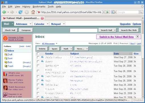
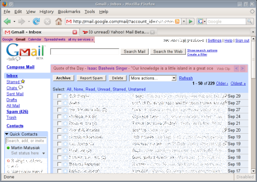
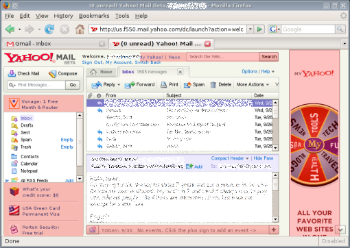
But before we do anything, let's mark out the perimeter. In the upcoming screenshots, I've allocated 828x588 pixels to Firefox, which is exactly the amount of space it gets on my desktop. Each of the services will be presented in that space. Free webmail services tend to support themselves with advertising, so that is a necessary evil for us users. To make this more obvious, I've marked out, in pink, the areas on the page which contain either advertising or endorsement of the site's own services.
yahoo_old.png

Starting with the existing yahoomail, the service, I'd say, is quite functional. When I log in, I come to an "overview page", which is basically Yahoo's pretext for showing me ads. It also has some clearly non-localized stories from Associated Press which I've never even looked at. I've learned to ignore this page and click on my inbox, which opens the page shown in the screenshot. Here I have a list of messages, with folders on the left. Clicking on a message takes me to it (no AJAX, so I have to wait for a new page to load), but I can middle-click to open a bunch of messages in separate tabs, which I often do. This interface can be quite slow at times (whenever my connection is poor, or yahoomail is overloaded), so loading each new messages can take a while in those circumstances. There is an address book, and I can explicitly add entries to it by typing in new contacts. The message composer is very basic, but it has auto-completion for typing in email addresses in the recipient field (pulled from the address book, naturally). yahoomail has a spam filter, suspected spam lands in my Bulk folder, but I have mixed results with the filter. The ads are all concentrated on the left sidebar and aren't intrusive at all, the trained eye can easily ignore them. The total screen area occupied by ads is 6.6%.
gmail.png

Then came gmail, and made big, big waves. No other webmail service has made so much noise before. Well, gmail was one of the first mainstream websites to introduce AJAX to the world. When I log into gmail, I immediately see my inbox. This tends to take a little while, apparently there are quite a few things to load behind the scenes. But once it pops up, I see what the screenshot shows. Again, I have a list of messages front and center, with a list of folders on the side. It also displays my contacts below that. Interestingly, the contact list is not a static entity, it is built dynamically out of contacts with which I exchange emails. So I don't have to type in entries in my address book manually, it is done for me. (As a small sidebar, I can also use the contact list to chat with my contacts over googletalk, without leaving my inbox.)

Clicking on a message here opens the message on the same page, which is quicker than loading a new page. Unfortunately, middle-clicking on the message title doesn't work here. gmail is packed with AJAX functions, however. For instance, marking messages as spam removes the message from sight dynamically. The message composer is a bit more advanced, there is a rich editor available, and a built-in spell checker. Once again, auto-completion for typing in message recipients (pulled from my dynamic contact list). gmail's spam filter is very good, I only get the odd message in my inbox that doesn't belong there. The advertising is also very discrete, just text, no images, and blends right in with the rest of the page. The advertising area is 4.4% of the page.

The search function, powered by google, enables me to find old messages with good accuracy, which is something yahoomail doesn't have at all.
yahoo_beta.png

gmail isn't news, it was news. Let us then turn to what is news presently - the new yahoomail beta. The new service has received some glowing reviews, I won't bother digging for them - those who have written it know who they are. yahoomail beta is Yahoo!'s response to gmail, then. Let's see how they compare. The first thing very striking about the new service is the amount of advertising they have put on it. It's impossible not to notice this, it immediately strikes me as one of the more ad infested websites I use. The pink bits here make up for a total of 20.8% of the whole page. Do you see the little arrow in the bottom right corner? The tooltip for that reads "Click to scroll down to view the rest of this advertisement". How adorable is that? Has anyone ever scrolled to see more of an ad? Okay, let's put that aside for now. Logging into yahoomail beta again opens an "overview page", which is again just a place to display ads and news stories. I'm not the slightest bit interested in news, I'm looking for my email. So I click on the Inbox tab.

This is Yahoo hoping that frames will come back in style. I have a list of my messages, with a display area below it, just like in most mail clients. So when I click on a message title, I see the message in the display area. Below the message display area there's an endorsement for Yahoo's calendar, which I have absolutely no use for (and it's impossible to remove the little ad to better use the available screen space). On the right, there's a huge ad. This interface is horrid design. Web design 101 says every website should be tested across a wide range of screen resolutions, to make sure it functions well in them all. Either Yahoo is oblivious to this, or they just don't care. At the same time, the fonts have become smaller, which suggests that the pages aren't meant to be viewed at high screen resolutions anyway (ie. they really want you to have that kind of ads-to-content ratio). With the amount of space occupied by ads, the list of messages and the message display area beneath is squashed in between frames, and is a real pain to use. When I open my inbox, I only see about 7 messages in the list, and there's no way for me to scroll the page, because the list is in a damn frame. When I click on a message title, I get about 5 lines of message text displayed in the display area, which is about as convenient as reading the same message off the screen of a cell phone. And this is it, there is no "open message in a new tab/window" or anything like that, this is the only way to view messages. The most important element of a webmail system is browsing the inbox and reading messages, and Yahoo have completely botched it. I could just as well end it here and declare yahoomail beta a broken service. But in the spirit of completeness, let's finish this.

On the left, I have my list of folders, and a new search box to search my email, which I guess is a brand new gmail-ish feature that yahoomail beta is hoping will make it possible for us users to maintain some idea of our email history. The classic yahoomail really lacks this, it only gives me an option to browse old messages, 25 message titles per page, until I find the one I'm looking for.

The address book does not seem to have changed in the new yahoomail, I still have to add contacts by hand. The spam filter I imagine is the same as with classic yahoomail, but I haven't used the service long enough to know for sure. The message composer has been given a makeover, it now has a rich text editor and a spell checker. There are some AJAX additions to the interface, like "dynamic" spam classification of messages (like gmail has). But these additions are very underwhelming considering how slow and bulky the service generally feels. There are way too many ads, gmail's pages are much simpler and more to the point.

gmail is head and shoulders above yahoomail beta, it is intelligently designed to be efficient and "smart". yahoomail beta is a patchwork of half baked ideas and compromises, which results in a service that is less functional than the original one. yahoomail beta is not about to win significant market share unless it gets a complete redesign (which is generally not something you do with beta software). I am migrating my email increasingly to gmail, and the launch of yahoomail beta has begun to speed that up.

In a few parting words, here are some of the quotes yahoomail beta proudly prints on its opening page.

  • "The new interface is stunning in its simplicity and ease of use."
    — PC Magazine
  • "Yahoo! Mail came out on top again."
    — Associated Press
  • "Graceful, swift, and respectful of your privacy, Yahoo! Mail Beta makes a gracious e-mail host..."
    — CNET

Enough to impress executives, is it? But will it fool the users? Not a chance.

EDIT: Apparently the classical yahoomail does have a facility to search in messages, this seems to be a recent addition as I've never seen it before.

why do Windows filesystems suck so?

September 26th, 2006

As far as I know, there has been *no* development on the filesystem front at Microsoft. Of course, there was the vaporware WinFS, but that was supposed to be a meta fs on top of ntfs anyway. So, I think it's safe to assume that the filesystem that shipped with Windows NT, ntfs, continues to please. Otherwise there is still fat32, and the WinXP installer gives you the option to use either one. I am not impressed by any of these two.

Historically, fat32 was a replacement for fat16, it was great when it first came out with Windows95, supporting long file names, files up to 4gb size etc. But today, 4gb is a size exceeded by lots of files. fat32 is also fairly prone to crashes. If you pull the cord just as a file write is in progress, the drive halts in a corrupted state. So next time you boot, Windows will run scandisk to examine the state of the damage. This could be harmless, it could also be quite serious, depending on your luck.

Enter ntfs, the "industrial strength" filesystem the world was waiting for. ntfs I think is the only option in Windows Vista, and it looks like Microsoft will be banking on it for many years yet. And yet I've had more unrecoverable crashes with ntfs than I've had with fat32 (which I've use longer). I recall using Partition Magic back in the days, which worked like a charm with anything but ntfs. And the checks for corruption on ntfs volumes would also takes ages to complete. I stopped using ntfs as I just didn't trust it. It's like a complicated beast of a system (which I guess is why old PowerQuest didn't do such a great job of supporting it), that noone (save for MS) seems to understand, that only works well in ideal conditions (don't try to resize it or anything 'crazy' like that) and if it crashes, who knows what to do. The lack of ntfs support on linux also tells the story of a filesystem which might just be more complicated than it needs to be. In addition, there's no straightforward way to make a full system backup (without specialized 3rd party software), because of all the special locks and restrictions MS has on selected files.

While it's evident that fat32 is antiquated, I would only use ntfs while vigorously backing it up (to the extent that it's even possible), knowing that if it blows up, there's a host of complicated ntfs recovery tools out there, most very limited in what they offer, but none that I've actually succeeded doing anything with.

welcome to the family, Trekstor

September 26th, 2006

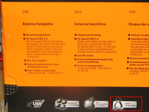
I bought a usb stick 6 months ago. I was skeptical, as I didn't think I would really need it, and it turns out it was only useful for about 2 weeks. Now it's just lying on a shelf waiting to be used for something again. I bought the cheapest one they had at Media Markt, I believe it was about €22 for 256mb. The brand was Trekstor, a company I had never heard of before, but on the box they print that the stick is compatible with Linux, how unusual. So I bought it, and it was. After all, it's just a usb mass storage device, of course it's compatible, it's the most common type of usb device. But it's refreshing to get a break from the "requires Windows" mantra, for a company to have the guts to print "Windows/Mac/Linux" on the box.

trekstor_usbdrive.jpg

So the other day I was looking for an external usb drive, cause my laptop drive isn't that big, and lo and behold, there's Trekstor again. Again they're the cheapest and they even have a penguin on the box. So I went Trekstor again, a nice quiet 200gb external drive is now the latest addition to my [very short] list of gadgets. The little printed manual doesn't mention Linux at all, but the instructions for Windows are exceedingly simple, and Linux users don't need that hand holding anyway, if there's a driver for the device somewhere on the internet, they will find it and figure out how to use it.

trekstor_penguin.jpg

It turns out Trekstor also manufactures mp3 players. If and when my iRiver dies, I will seriously consider going with Trekstor. They may not have the strong audio focus of iRiver, but they support ogg (which so few companies do) and their players are based on... usb mass storage, just like the usb stick and the external hard drive. And since iRiver seem to have gone completely native with DRM, it's time to look for another vendor anyway.

on the steep curve

September 25th, 2006

Whenever you start doing something after a long pause from it, you generally suck. But since you've been doing it in the past, you're don't suck like a beginner, you just suck cause you're out of shape. And that's why the first few times you improve rapidly. You go from zero, nothing, to almost-showing-signs-of-ability. In short, the steep curve. Today was my third time playing and I'm about half way to the level I once was at my peak.

Of course, after reaching the almost-decent level, the steep curve ends. Then comes the polish phase, which takes forever. I played football for 10+ years and I would have maybe 1 games in 10 when I felt it went off like clockwork. The rest of the time it was always part good, part not-so-good. And always working on the polish, repeat ad nauseum. Tennis is looking really good at the moment, I've drawn up a schedule to play twice a week and there seem to be more people out there interested in playing. Today was a beautiful 2 hour session, it started to drizzle toward the end, gorgeous.

My game still needs a lot of work, I'm slow and my reflexes are off. But once I get the basics to a half decent level, there'll be plenty of time to polish, polish, polish.